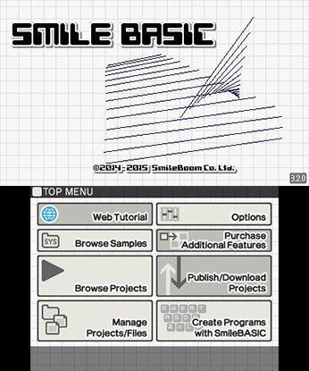
So according to the screenshot, the button colors are a kind of tan. I'm sure that's probably how they're rendered (or maybe they've been changed), but I'm looking at my 3DS right now and they're definitely not tan lol. I want your thoughts on the matter:
I think the buttons are more of a nice gray rather than a tan. Something like #E9ECEA:
 However, our reference screenshot has been stuff like this:
 I want your opinion on this. Do you think the SmileBASIC main menu buttons look more like the gray color I posted, or the tan color on the screenshot? Or do you not see a difference?
Just so you know, our current Program List color has been changed to the newer gray color rather than tan: http://smilebasicsource.com/search?category=Programs
(see gray color on http://www.w3schools.com/tags/ref_colorpicker.asp)
 However, our reference screenshot has been stuff like this:
 I want your opinion on this. Do you think the SmileBASIC main menu buttons look more like the gray color I posted, or the tan color on the screenshot? Or do you not see a difference?
Just so you know, our current Program List color has been changed to the newer gray color rather than tan: http://smilebasicsource.com/search?category=Programs
(see gray color on http://www.w3schools.com/tags/ref_colorpicker.asp)